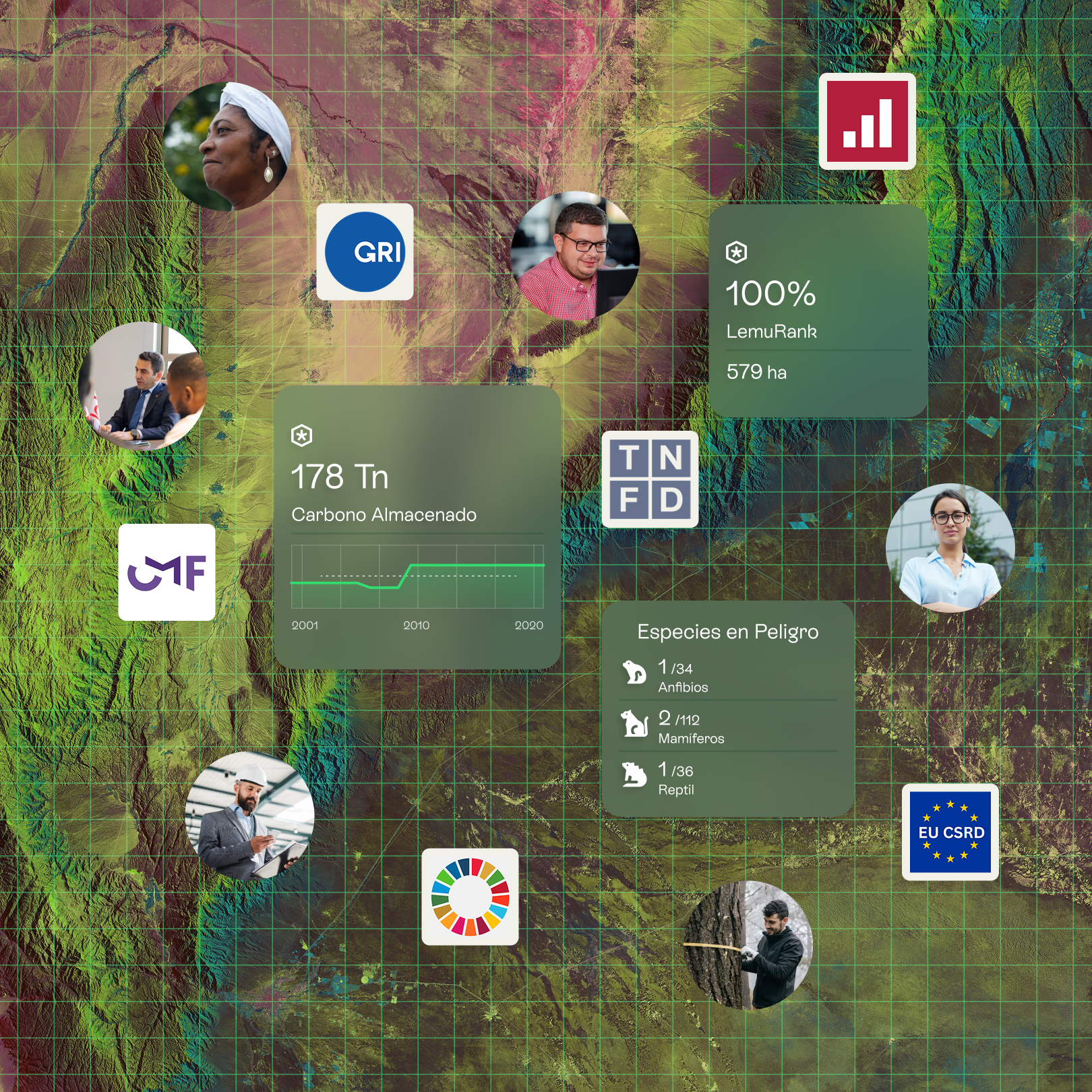
Lemu Atlas

A B2B platform that turns fragmented nature data into decision-ready indicators for regulatory reporting, risk, and strategy.

My role: End-to-end product designer, discovery to delivery, with ownership over how nature data gets visualized, the technical and product core of Atlas. Worked across science, engineering, product, and business.

There is no "Excel" for nature: biodiversity data spans satellite series, camera traps, bioacoustics, eDNA, field sampling, and models, and companies now need it for regulation (TNFD, CSRD, IFRS S1/S2), risk, and strategy.

Impact (Atlas, 0.1 to 1.0 in one year)

What I learned
The hardest part was learning enough nature science to build a system rigorous enough for scientists to trust, while keeping it usable for people who open the platform only a few times a year.

2025 - 2026
Chile
Product Design Organizations Sustainability Technology
My Role
End-to-end Product Designer
Leadership
Leo Prieto, Sangeetha Narayan, Sebastián Eyzaguirre, Christian Peña, Paulo Paredes, Pablo Gonzalez
Team
Science, Technology, Design, Product

The Challenge

Atlas has two audiences with opposing needs. Decision-makers (sustainability, compliance, management) use it infrequently and need fast, trustworthy answers for a report, an audit, or a board meeting. Technical validators (scientists, environmental engineers) need depth, traceability, and granular control.

The job was not to simplify the data, which would strip its value for the second group, but to structure the complexity into layers of progressive value, so each profile reaches the depth it needs without friction.

Project image
User Persona's Matrix

My role and process

I participated end-to-end, with particular ownership over systematizing the visualization of nature data, the technical and product core of Atlas.

Discovery

  • Desk research on nature reporting standards (TNFD, SBTN, GBF, CSRD/ESRS) and on analogous data platforms (BI, geospatial, scientific).
  • Interviews with stakeholders and potential/real users across sectors (forestry, mining, energy, agriculture, financial services).
Project image

Conceptualization: Systems before screens

Instead of designing each indicator by hand, I helped build the system underneath.

Project image
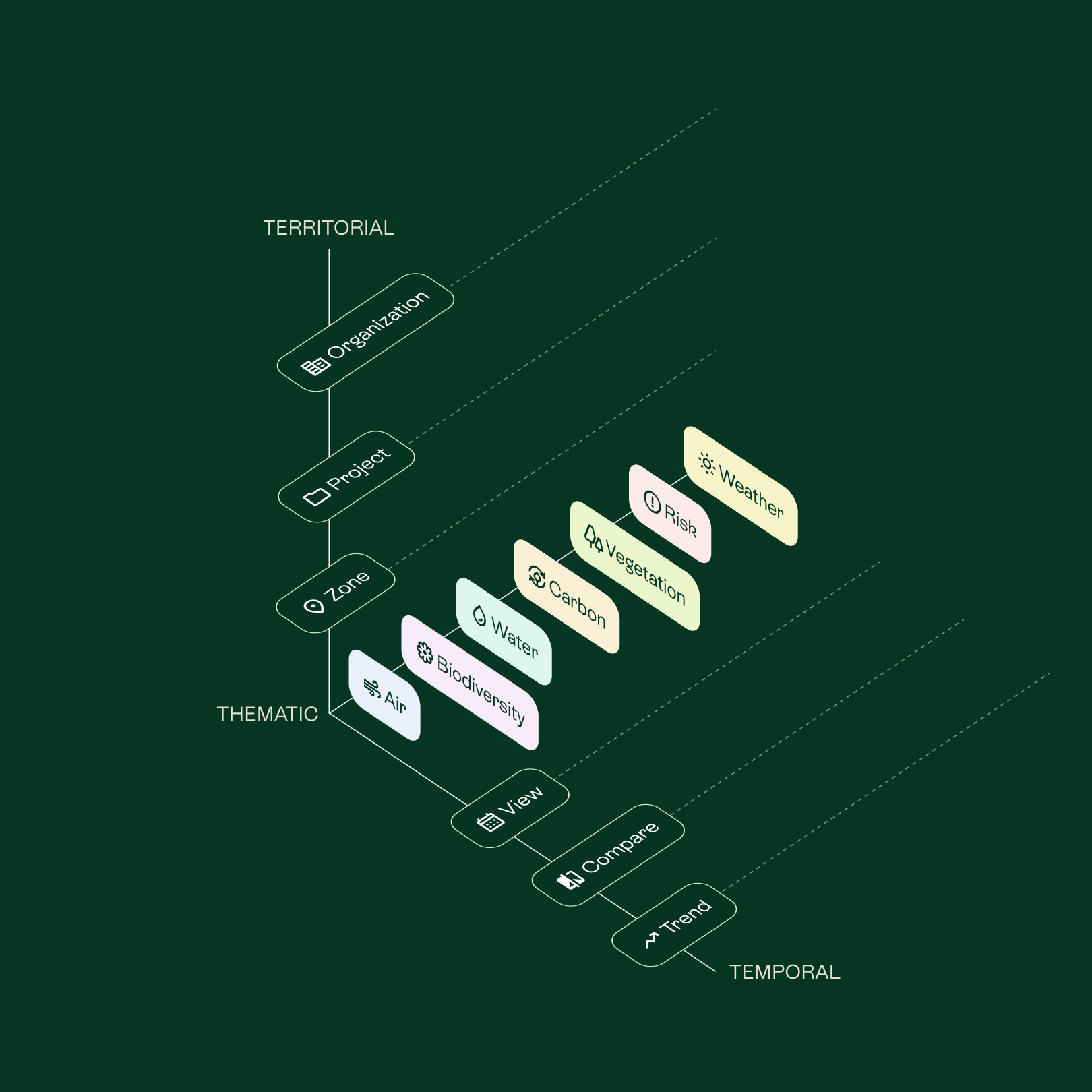
I helped conceptualize the platform information architecture. It was abstracted into 3 axis, Territorial, Temporal and Thematic.
Project image
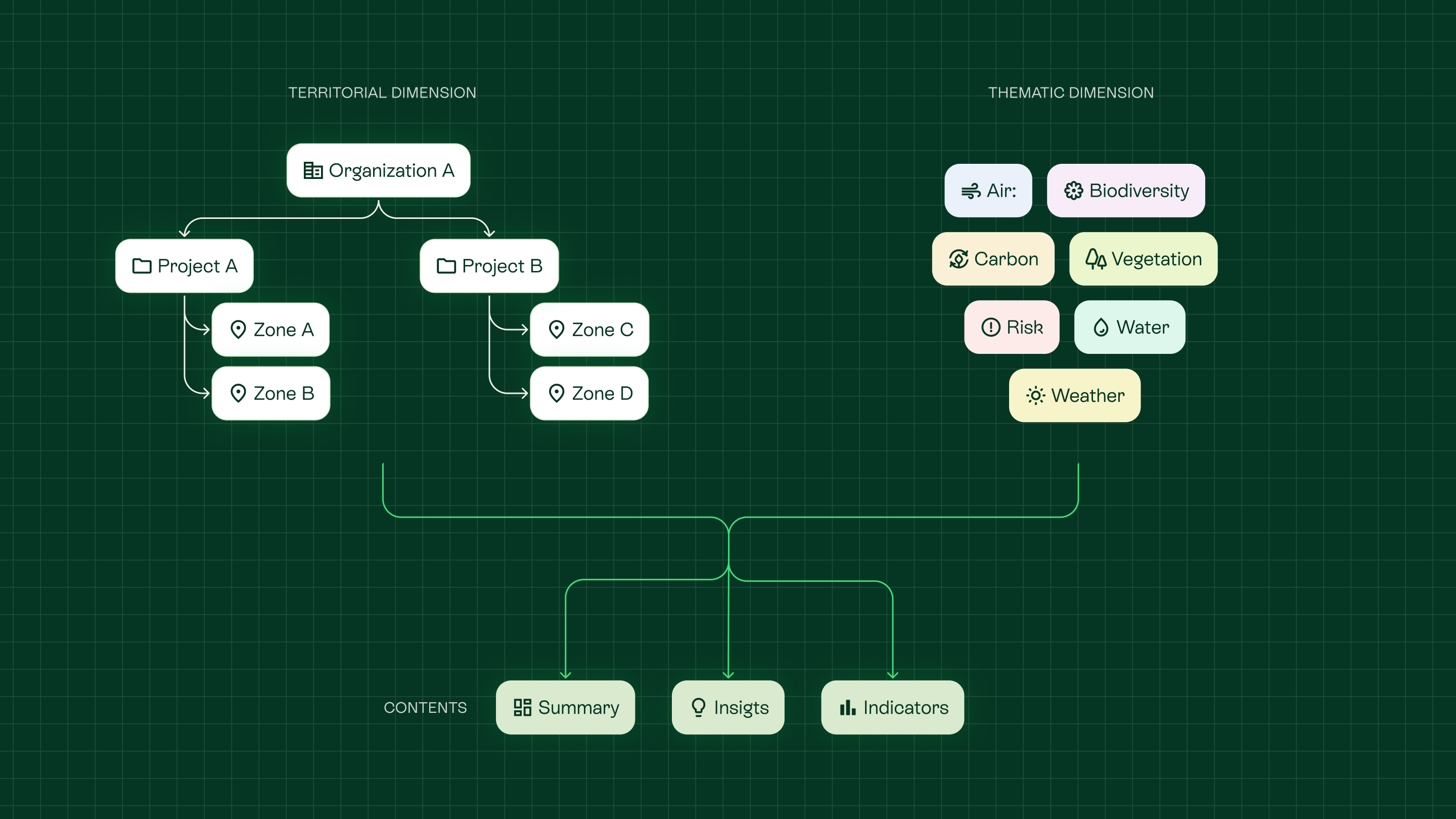
Territorial and thematic paths to the platform content

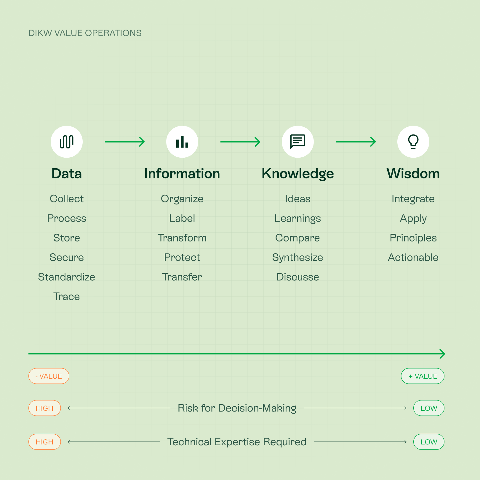
A value-and-risk framework (DIKW)

I mapped the Data → Information → Knowledge → Wisdom hierarchy against two axes, decision risk and required expertise, to decide which features actually raise the value of a data point rather than prioritizing by request volume.

Project image
Note: This conceptualization was done before advancements in AI allowed for its full integration into SaaS projects.

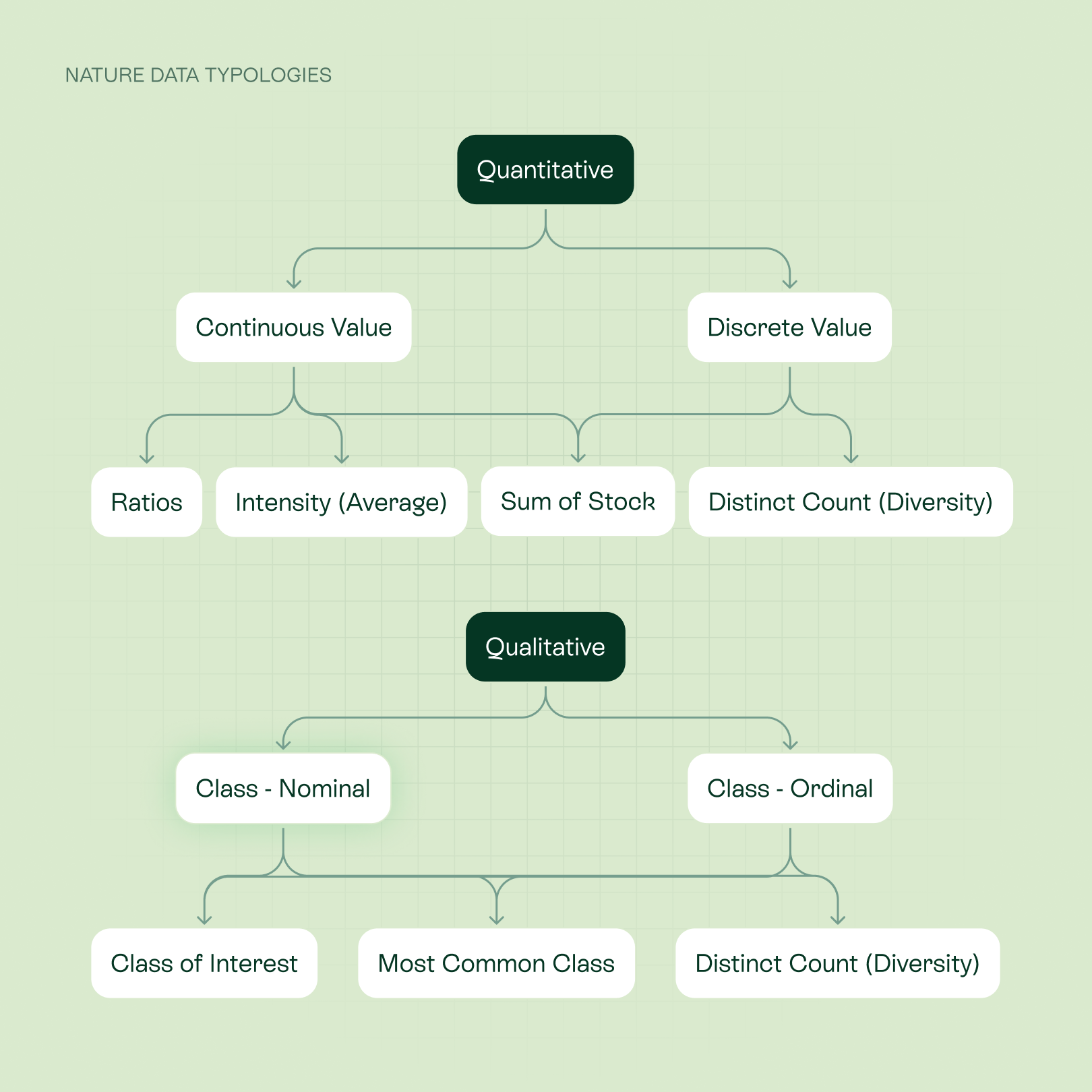
A data-typology catalog.

I classified the data types Atlas handles (continuous, discrete, and qualitative) and matched each to valid visualizations, territorial and temporal aggregations, and operations, so indicators could be defined systematically, not case by case.

Project image

From data typologies to components

Designing it meant accounting for the variability of the data behind it, not only the visual and the person reading it, but the data structure feeding it. The result is one component that carries very different indicators without a redesign. This systematization is what changed the pace: from around three sprints per indicator to several in one sprint.

Project image
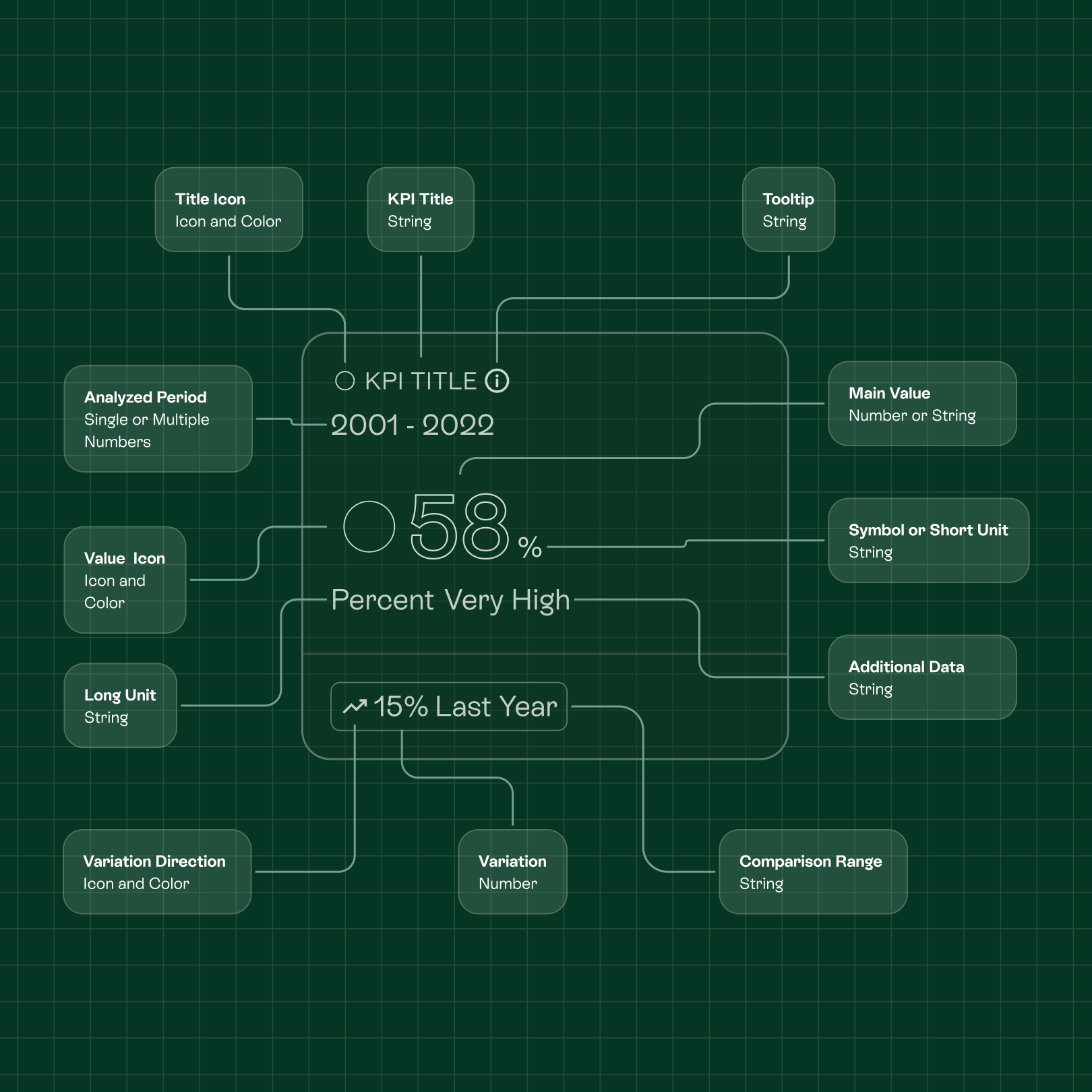
Anatomy of the KPI component: every field it supports maps back to a real variation in the underlying data.
Project image
Kpis are an example on how the different components of Lemu Atlas needed to consider the different data typologies in a single and scalable visualization. While visually simple, most of the effort went into defining the technical specifications for fields and data.

From documentation to a thinking partner

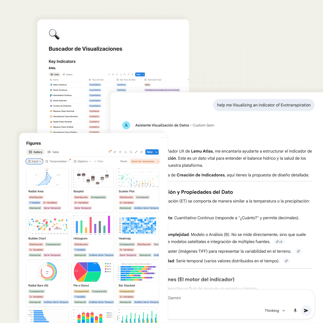
The catalog did not stay a reference file. It became an operational knowledge base feeding an AI assistant (NotebookLM) that science, tech, and design use to structure new indicators, defining data type, complexity, source, and temporality, before a screen is built. That removed me as a bottleneck and gave a globally distributed team a shared reference to align on without a live meeting for every indicator.

Project image

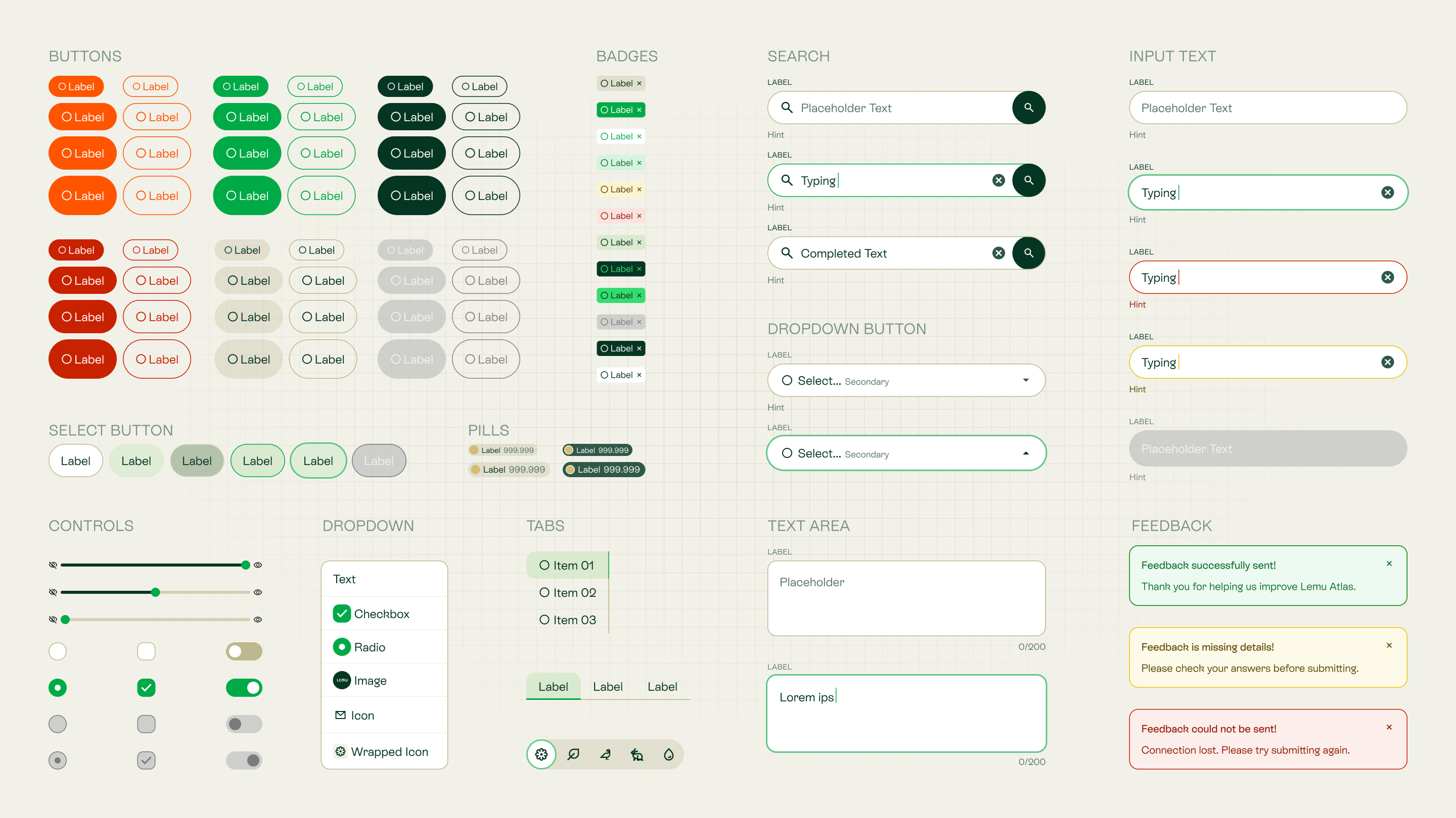
Tapül, Lemu´s Design System

I translated the data-typology catalog into Tapül, a modular component layer (radar charts, boxplots, heatmaps, time series, and more), built hand in hand with frontend engineers.

In Mapuche culture, Lemu means Forest, a sacred ecosystem of natural interconnectedness. Following this logic, I created Tapül (leaf), the modular component layer where every element works in harmony to sustain the whole.

Project image
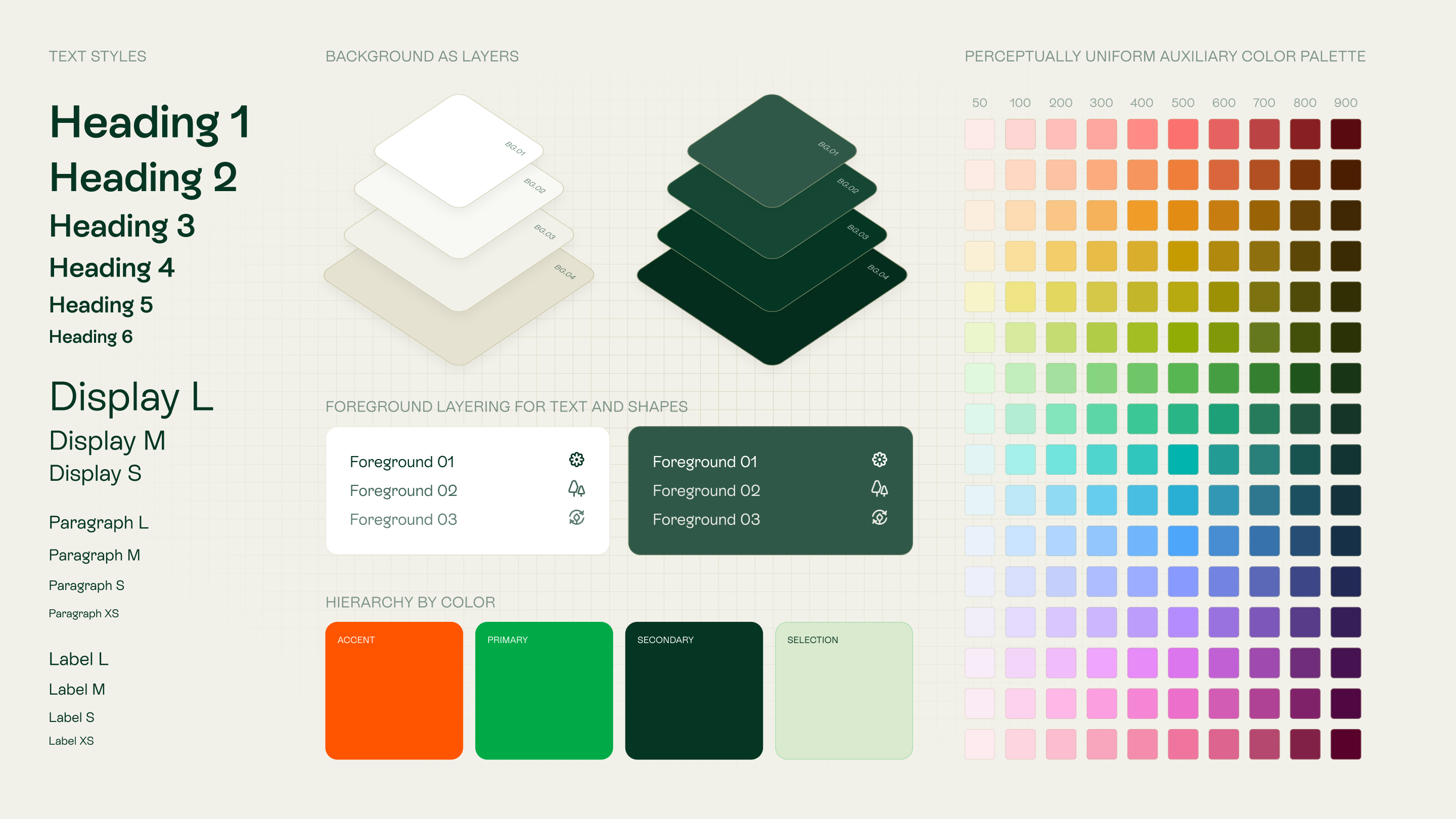
Tapül Foundations were heavily based on depth as a way to make the UI more readable.
Project image
From day one, the design token architecture was structured to support light/dark modes and multi-device scalability through the reuse of foundational primitive tokens.
An example of how the token structure allowed a fast and easy change from light and dark modes
Project image
Tapül Foundations

The Design System was split into three libraries, Foundations, Atlas components, and Icons, so agnostic files could be reused across Lemu's platforms. The token architecture supported light and dark modes and multi-device from day one, with accessibility built in. A depth-based visual system brought clarity to complex layouts, and green was restricted to primary actions.

Figures Components
Project image
Cards Components
Project image
Content Components

Design & Delivery

Delivery meant working shoulder to shoulder with engineering, science, and product management to define technical scope and keep everyone moving in sync. We relied on Jira to track scope and handoffs, Notion to document decisions and design rationale in a place science and engineering could both access, and Figma for the components and specs engineering built from. As the documentation load grew, AI-generated artifacts became part of that toolkit too, helping turn design decisions into structured, reusable references.

Project image
Project image
From left to right: how usability testing guided the iteration to find a balance between a data-heavy structure and a map-based UI.
Navigation across Territorial Units
Project image
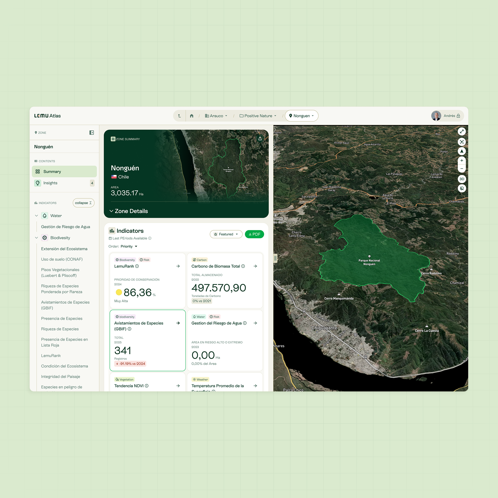
Zone Summary Page
A smart breadcrumb doesn't just help users orient themselves, it enables fast navigation between sibling elements.
Project image
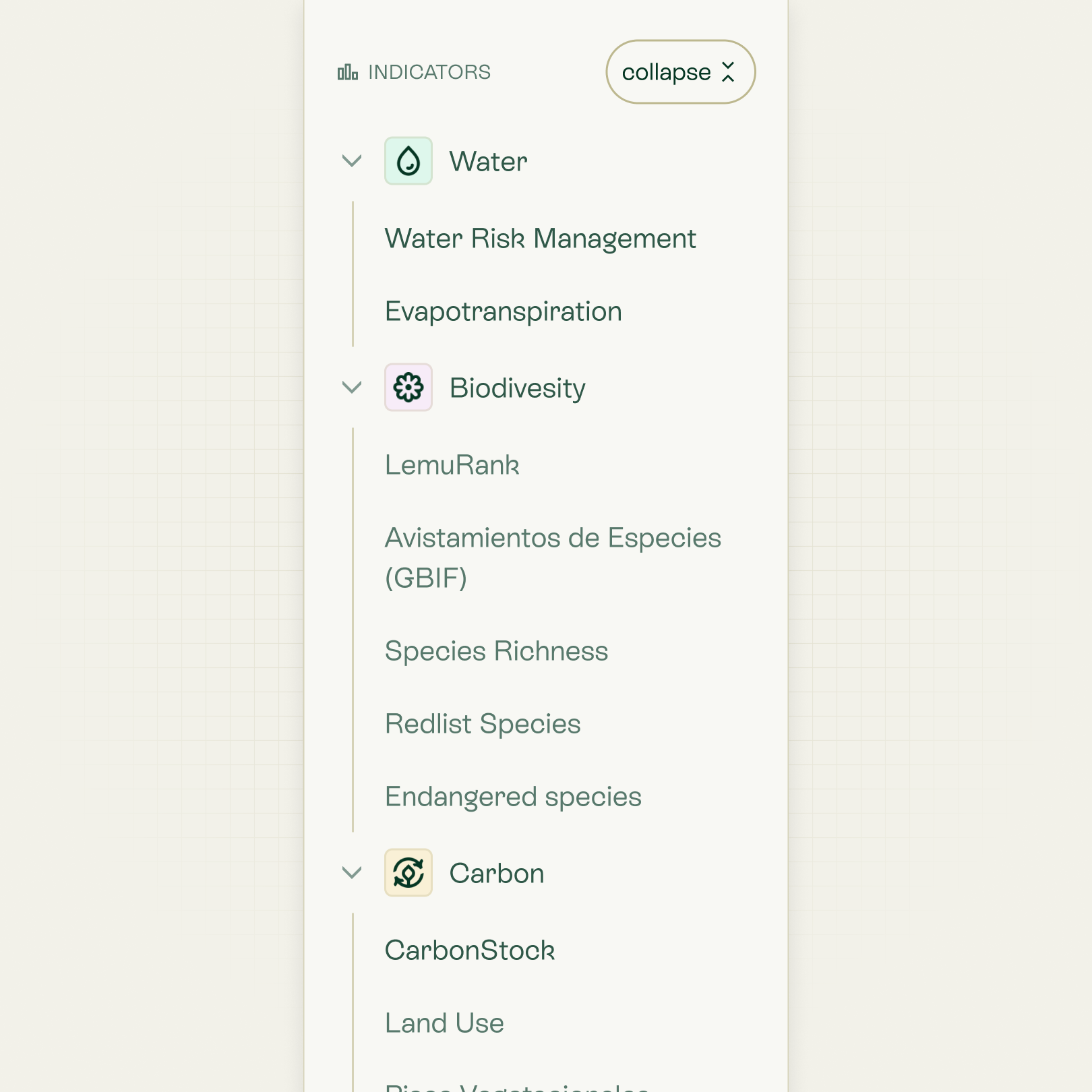
For relevant territorial units, the indicator navigation bar by category is always present.
Indicator Pages, the technical core of the platform

AI Prototyping & Internal Tooling

To validate upcoming roadmap features, I built a centralized UX Proof of Concept (PoC) repository for rapid user testing. Leveraging AI-assisted prototyping allowed us to quickly generate high-fidelity functional flows and validate complex hypotheses with real users, while serving as a functional bridge to communicate intricate business logic to engineering before development.

Additionally, I utilized AI to "vibe-code" several internal DesignOps tools. These solutions successfully eliminated operational bottlenecks, empowered team members, and accelerated overall delivery by speaking the exact same technical language as engineering.

Centralized UX Proof of Concept repository for validating complex prototypes
Built custom tools for charts and maps using the same libraries as the engineering team to improve design handoffs.
Developed a custom mockup tool, empowering non-design teams, particularly sales, to create their own assets.